
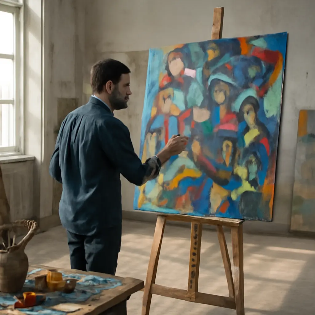
Negative space is the unoccupied area around and between objects in an artwork; it is not merely leftover background. By shaping that space deliberately, artists can make a crowded canvas easier to read, direct attention toward a focal point, and give forms greater visual impact. Design research and established art theory support the underlying principle: perception depends on relationships between figure and ground, while clear visual hierarchy helps viewers identify what matters first. This guide explains how negative space works, how artists can use it in painting, drawing, and design, and how to apply it without sacrificing richness or detail.
Negative space shapes visual hierarchy
Negative space, also called white space or blank space in some contexts, is the area that surrounds, separates, or lies within a subject. The term does not mean that the area must be white or empty: it may contain color, texture, atmosphere, or subtle marks. In Gestalt psychology, figure-ground organization describes how viewers distinguish a perceived subject from its surrounding field. The relationship can reverse, as in the familiar Rubin vase image, where viewers may see either a vase or two profiles depending on which region they treat as the figure.
This makes negative space an active compositional element. Its shape, size, contrast, and position influence how quickly a viewer recognizes forms and where the eye travels. On a crowded canvas, carefully designed intervals can create separation and emphasis without removing the objects that make the scene feel abundant.
Figure-ground relationships
Figure-ground relationship is the visual distinction between a focal form and the area perceived behind or around it. A strong silhouette, a difference in value, or a clear contour can help establish that distinction. When objects overlap repeatedly, edges compete and the viewer may struggle to determine which forms are in front. A deliberate pocket of open space around an important shape can restore clarity and make its outline easier to read.
Negative space is not limited to the outer background. The gaps between a person’s arm and torso, the opening inside a handle, or the sky visible between branches are also negative shapes. Artists can assess these spaces as carefully as they assess the objects themselves.
Visual hierarchy and attention
Visual hierarchy is the arrangement of elements according to their relative importance. Scale, contrast, placement, detail, and surrounding space all contribute. A small, high-contrast subject surrounded by quieter areas may attract more attention than a larger object embedded in visual noise. Conversely, an intentionally tight cluster can signal energy, intimacy, or pressure.
The implication is practical: artists do not need to simplify every crowded scene. They can preserve complexity in selected areas while reducing contrast or detail elsewhere. This creates a path through the composition rather than asking every mark to compete equally.
Negative space improves crowded compositions
A crowded composition contains many objects, patterns, or marks within a limited area. Negative space improves such a composition by separating visual groups, clarifying silhouettes, and establishing breathing room. The goal is not necessarily to make the image sparse; it is to make the relationships among its parts legible and purposeful.
The same principle appears in graphic design. The Nielsen Norman Group describes white space as the empty space between and around page elements, noting its role in separating content and supporting scanning. Although a painted canvas is not a web page, both benefit when spacing communicates grouping and priority. In art, this can mean leaving a calm passage beside a busy cluster or using a broad shape of sky to offset intricate architecture.
Open space as a focal-point tool
An open area can make a focal point more prominent by reducing nearby competition. For example, in a still life of fruit, vessels, and patterned fabric, a relatively quiet background behind one brightly lit pear can give that fruit visual priority. The surrounding space acts like a frame, even when no literal border is present.
The contrast need not be empty versus detailed. A soft, low-contrast passage can serve as negative space against sharper, more saturated objects. A useful test is to squint at the canvas or view it as a small thumbnail: if the focal form remains distinguishable, the value structure and spacing are likely doing their work.
Gaps, channels, and visual rhythm
Negative spaces can be understood as gaps between forms, channels that guide the eye, or larger open zones that balance dense clusters. Repeated gaps create rhythm; varied gaps create emphasis and movement. If every object is separated by an identical interval, the result may feel mechanical. If every gap is squeezed shut, the composition can feel congested. Alternating tighter and wider spaces often produces a more natural visual cadence.
Artists can also use directional channels. A wedge of open sky between buildings, for instance, may lead the gaze toward a distant landmark. A narrow gap between figures can suggest distance, tension, or connection depending on its shape and placement.
Using contrast without flattening the scene
Negative space can be defined by value, color, edge quality, or texture. A dark gap between light objects may separate them sharply; a softer, similar-toned interval may keep them connected while still distinguishing their contours. Atmospheric perspective offers another option: distant areas can be lower in contrast and detail, giving foreground forms room to stand forward.
A common mistake is to make every background area uniformly blank. That can flatten a scene and weaken its sense of place. Instead, vary the negative space: keep some areas quiet, allow others to carry subtle texture, and reserve the strongest contrast for the regions that should command attention.
Artists can measure and revise negative space
Negative space is easier to control when treated as a set of shapes rather than an undefined background. Drawing the contours of gaps, comparing their widths, and checking the composition at different scales can reveal imbalances that are hard to notice while concentrating on individual objects.
A practical thumbnail method
Before adding detail, make several small thumbnail sketches. Mark the largest masses as simple light and dark shapes, then identify the largest open areas. If the composition reads clearly at thumbnail size, its broad hierarchy is likely sound. If it collapses into one dark mass, adjust spacing, overlap, or value before refining texture.
- Block in the main objects using simple silhouettes.
- Draw or shade the gaps between them as distinct shapes.
- Compare the size and direction of those gaps, not just the objects.
- Reserve the clearest open area for the region that needs emphasis.
- Recheck the result in grayscale and at a reduced scale.
A real-world example: crowded urban scenes
A street scene may contain signs, windows, pedestrians, vehicles, and architectural detail. Rather than deleting these features, an artist can group them into a few larger masses and use openings—such as a bright strip of pavement or a wedge of sky—to separate foreground, middle ground, and distance. The open shapes help the viewer navigate the density while preserving the character of the place.
This approach also appears in poster and editorial design, where margins and spacing distinguish a headline from supporting information. The specific medium differs, but the compositional task is similar: organize competing elements so the intended message is recognized quickly.
Common problems and corrections
- Accidental tangencies: When two contours nearly touch, they can create an awkward, ambiguous gap. Either separate the forms clearly or make them overlap decisively.
- Uniform spacing: Identical gaps can feel static. Vary intervals to create rhythm and emphasis.
- Overworked backgrounds: Excessive contrast and detail can compete with the subject. Reduce their intensity in areas that should recede.
- Unintentional dead zones: A large empty region may feel disconnected if it does not balance, frame, or direct attention. Adjust its shape or connect it visually to the composition.
- Overcorrection: Removing too much detail can drain a scene of atmosphere. Preserve selective complexity where it supports the subject or mood.
Negative space turns visual density into visual value
Negative space is a compositional resource, not a leftover. Figure-ground relationships explain how viewers separate subjects from surroundings; hierarchy shows how space can guide attention; and practical methods such as thumbnails, silhouette checks, and value studies help artists revise crowded images with intention. Open areas can frame a focal point, create rhythm, and make detail more legible without forcing an artist to simplify the entire scene.
To put the idea into practice, choose one artwork in progress and map its largest empty shapes before adding more detail. Ask whether each gap separates, connects, balances, or directs the eye. By giving those spaces as much attention as the objects, artists can transform visual clutter into purposeful complexity—and make a crowded canvas feel richer rather than merely fuller.
Sources: Encyclopaedia Britannica, “Gestalt psychology,” https://www.britannica.com/science/Gestalt-psychology; Nielsen Norman Group, “White Space in Web Design: What It Is and Why It Matters,” https://www.nngroup.com/articles/white-space/; Tate, “The Elements of Art,” https://www.tate.org.uk/art/art-terms/e/elements-art